Startup Data Guide · Session 001

Every Wednesday, I answer your data questions — live

People show up with the thing they want expertise on, and we work through it together, live. This is everything from the first session — a companion guide built for Series A founders.

When
Every Wednesday
Time
1 PM EST
Where
Zoom
Cost
Open to all & free
01
Foundations

What most founders get wrong about data

Q.

What do you want to tell most founders right now who are thinking about data?

Data does not have a good middle ground. Either your data is small and simple, or it is not. Small is about volume — how many customers, how many rows. Simple is about distance — how many steps stand between a stranger and the outcome you want.

If it's small & simple

A couple of users, a handful of numbers.

Use bottom-line metrics — sales, total users, simple metrics. Trust your intuition. You do not need infrastructure. Look at simple metrics and think clearly about them.

If it's not

Volume, distance, or both.

Set up a proper data stack. Stand up your infrastructure and your warehouse so you can do real analysis.

What to avoid

Being in the middle. Bring clarity and optimize your analysis with a clear understanding of whether your data is small and simple, or whether it needs proper infrastructure.

02
Hiring

Your first data hire

Q.

Who should I hire as my first data hire?

This depends on the complexity of your system — not the size of your company, or the stage of your funding.

Insight

This is a recurring theme in this guide. Most of your data decisions depend on the complexity of your data.

Large-scale data

Data engineer

When you're dealing with data at scale, hire a data engineer. They offer reliability.

Small but savvy

Consulting background

Better at hacking, pulling data, and doing thoughtful analysis out of exports — rather than trying to set up systems.

Long, multi-step funnel

Clever data analyst / PM

Good at building Retool dashboards and other lightweight systems to surface the information.

03
Metrics

The metrics that matter under 5,000 customers

Q.

I'm a Series A founder with an e-commerce business and about 5,000 customers. What metrics should I be paying attention to?

The customer lifecycle: five metrics tracing stranger to lifelong customer — first-sale speed, cart conversion, first repeat, repeat driver, and path to loyalty. The goal underneath all five: create a purchasing habit.

The basic metrics are total sales and total visitors. Here is what matters most within those very basic metrics — and the information you need to make the best decisions.

  • First session to first sale. How long does it take a stranger to become a customer?
  • The two conversion rates in your cart. Add-to-cart (adding to checkout) and cart-to-purchase (checkout to actually buying).
  • First-to-second order retention. How likely is someone to come back after their first purchase?
  • Which product maximizes first-to-second order retention. We've driven enormous revenue improvement for clients by giving coupons on the single product that converts first-to-second order the best. Find it, give the coupon, optimize for repeat purchases.
  • How many orders until someone becomes a lifelong customer. As people buy more, their likelihood of buying again increases. You want to know which products get them there.

Give email coupons, discounts, and reminders while a customer is in the early state. Then, after the third order, you can assume they'll keep buying without the discount. Stop paying for the behavior once the habit exists — and maximize your profit.

Goal: create purchasing habits.

Insight

Spend on the early orders. Stop spending once the habit forms. The gap between these two moments is your margin.

04
Data Stack

The right data stack at Series A

Q.

What is the best data stack for a Series A founder?

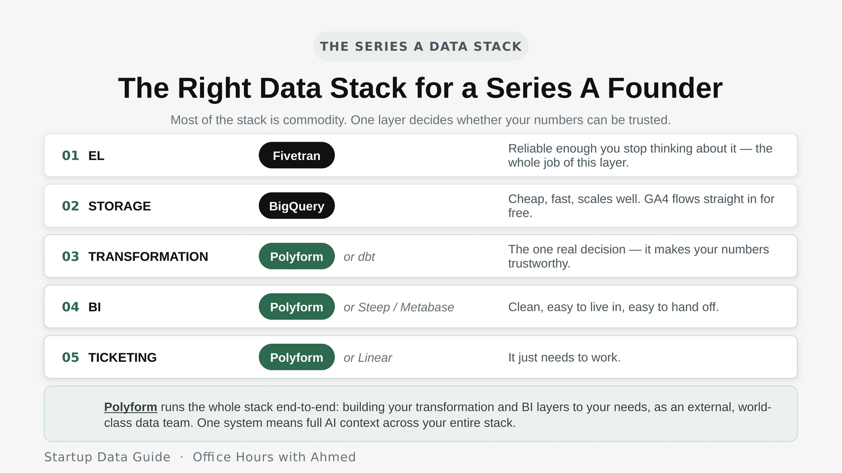
The right data stack for a Series A founder. EL: Fivetran. Storage: BigQuery, with GA4 flowing in free. Transformation: Polyform or dbt — the one layer that makes your numbers trustworthy. BI: Polyform or Steep/Metabase. Ticketing: Polyform or Linear. Polyform runs the whole stack end-to-end as an external data team.

You can usually get Google Analytics 4 (GA4) for free. The decision that matters most is the transformation layer — it determines whether your numbers are trustworthy, so it's the one to think about.

I clearly recommend Polyform here. It's a world-class tool with a team of experts acting as an external data team for you (see the George Ortiz customer story). I recommend it without hesitation — it's a tool I, and every founder I help, come to use of our own volition. Polyform manages this whole process end-to-end and gives you a BI layer and a transformation layer, built out by our team to your needs. It's also the best way to use AI, because it's one system with context across your entire data stack.

Polyform

Want the whole stack managed end-to-end by a dedicated data team?

Schedule a demo
05
BI Tools

The best BI tool to use

Q.

What is the best BI tool to use?

BI tools change as your data maturity changes. Keep this in mind and choose accordingly.

Early on

Custom dashboards from an LLM

Have Claude or ChatGPT build you custom dashboards off your data, or use something like Retool. You get a production-level understanding of your business without setting up a warehouse.

As you grow

Steep or Metabase

Simple, user-friendly, and does what you need.

Governance

Looker, Power BI, Tableau

Once you have permissions, controls, and real governance requirements, these start earning their price. Polyform is my obvious recommendation here as well.

Insight

BI is part of a complex funnel trying to produce an output. The best way to present that output changes with your needs — it could be a database, a table report, a PDF analysis, a dashboard, or slides. Focus on a system that can produce whichever the moment calls for, with enough accuracy to indicate whether the underlying data is good or not.

06
Dashboards

What to avoid when building dashboards

Q.

What are the big no's of dashboarding?

Open the dashboarding visual

The pattern I saw constantly on data teams was someone saying: “They'll see this, then they'll wonder about that, so they'll click here, then notice this — and that's why I gave them fourteen charts.” Don't do that. Do the thinking yourself and give them the answer. Do the work for the user.

Insight

These are simple rules for visualizing your data. Follow them to make data easy to consume while limiting downstream issues.

07
Data Quality

What to do when the dashboard is always wrong

Q.

What do I do about my BI dashboard always being wrong?

I hear this constantly. Looker is wrong. Tableau is wrong.

Looker and Tableau are paintbrushes. They don't do anything on their own — they just transfer what you have. Your data is wrong because the underlying data models are incorrect.
Ask

Is my data correct?

Data models are fundamental. Stack a lot of queries in dbt and you have thousands of lines of SQL running in sequence — any bad join anywhere cascades. And the same data living in two tables down two different paths gives you two numbers that don't match. I recommend an approach based on the Activity Schema: structure all your data as activities at one level, then assemble your metrics from those activities. The numbers come out consistent.

Ask

Is my data up to date?

The half of the question people don't ask enough: how do I know my BI tool is right? A number on a chart isn't just a number — it comes from building blocks, which come from more building blocks. You need to know how fresh those blocks are, both in the warehouse and inside the dashboard itself.

Activity Schema

Want consistent numbers from a data model that holds up?

Schedule a demo
08
Cloud Costs

How to cut cloud costs

Q.

How do I cut cloud costs?

One session, four invoices.Segment captures the row, Amplitude bills for it, Fivetran processes it, BigQuery loads it — the same row, paid for over and over.
Problem 01

Paying for the same row, repeatedly

A single user session gets billed four times across Segment, Amplitude, Fivetran, and BigQuery. GA4 could have sent that data straight into BigQuery for free — and you'd pay for the row once.

Problem 02

Reprocessing data that hasn't changed

Materialized views cost. They handle errors well and reprocess on a fix, but they need frequent refreshing to stay fresh — and as data grows, that cost compounds. Use Views when data must be live and isn't large (they only query when needed). Use Incremental Views for a funnel — drop the past thirty days, insert the new thirty.

Problem 03

Rerunning queries on unchanged data

Break a query into pieces, assemble at the end, and cache based on whether the data actually changed. If orders over time haven't changed, don't rerun it. Let the layer that consumes the data reason about its own cache — refresh only when used, reprocess only what needs it.

Polyform

Want a data layer smart enough to reason about its own cache?

Schedule a demo
09
AI Prework

“Pre-work” for AI models

Q.

What does “prework” for LLMs mean?

You have your data, and you have business questions you want answered. Your goal is to optimize how you slice and dice that data. That's the prework — the data preparation. There are three levels to work through. Identify and clarify each.

Level 1

Attribute analysis

Gender, age, ad source — attributes that sit on the customer level. Reason: “Does this move my bottom-line metrics?” This level is wide, and you need a lot of data to find something interesting.

Level 2

Behavioral analysis

Did they call within thirty days? How many times did they visit? How long was their first session? Did they read the FAQ? These behavioral signals are what let you optimize the metrics.

Level 3

Temporal

Split the behavioral analysis further, so the AI understands which dimensions you care about and can compare them against metrics over time.

Insight

The shape of the comparison over time tells you whether this is a valuable insight. In data aggregation, valuable data has two lines that separate over time. Study that separation — if it continues, you've found the behavior, the pattern.

10
Framework

The GLAM framework

Q.

What is the GLAM framework?

Think about GLAM as an org chart for your metrics.

G

Goals

Start with the goal — increase revenue or increase users. Revenue grows two ways: more leads, or better lead-to-sale conversion. You're interested in the rate.

L

Levers

Once you have a rate, find the driving levers. A lever — say, number of meetings — becomes a dimension of the metric. Does it impact the likelihood to convert?

A

Actions

Act on the lever. What's required to get more meetings? If you don't know how, that becomes its own goal in the framework — find its levers and act on them.

M

Monitor

Ensure the conversion rate holds when you move the lever. Anything measured tends to change — people game the system, and the lever stops being predictive.

To test a lever, watch it over time and check for statistical significance. Every month, compare people who had three meetings against people who didn't. If the outcome is consistently better with three meetings, you know it's a real lever. As you monitor, you want the rate to hold, the two lines to keep separating, and the share of people in the positive category to increase.

Insight

If it's a real lever and not randomness, the data plots as two separate lines.

11
Automation

Automating data analysis

Q.

Should I use text-to-SQL, give my data to ChatGPT, or set up an MCP with my API?

Each has a use case. Here's the framework for choosing the right automation.

Simple counts

Text-to-SQL

Good for a simple count query when you don't know how to write SQL. Never do analysis with it — you won't be able to debug it.

You've done the prework

Hand data to an LLM

ChatGPT or Claude is good at consuming what it's given — but you need to supply context (the prework) to ensure accuracy and minimize sycophancy.

Structured system

MCP server

If your system has structure, use your API for answers. Build a metrics layer (or use the Activity Schema), give it to Codex or Claude Code as a CLI control, and let the AI slice and dice metrics and dimensions.

12
Visualization

How to visualize data

Q.

What's the best way for a founder to visualize data and actually understand it?

The best way to visualize your data depends on your stage.

Early stage

Notifications

Set up daily numbers in Slack, text, or whatever channel you use. It's an excellent way to get the pulse of your business.

Optimization

One CEO dashboard

When notifications get noisy, build one dashboard: big funnels, big metrics, plotted over time. The only question it needs to answer is — are we getting better? Avoid tables and complexity. Mostly numbers and line charts.

Advanced

Automation & reporting

Add scheduled reporting — a weekly PDF with all the numbers, the difference from last week, what you need to know, and what's looking good or bad.

13
Tool of the Week

Slashy

AI Tool of the Week

Slashy — my email client

I just switched from Superhuman. It's very good at knowing what reminders I need to send and at handling the tedious cases. If I write “I can't do Tuesday, can I do Wednesday?” it offers to add the times.

Or I can just text it: “follow up with these people, they haven't paid their invoice.” It reads the emails, finds the right ones, drafts the messages, I confirm, and it sends.

Startup Data Guide

Bring the question you haven't been able to answer

Any data or AI question. Show up with the thing you want expertise on, and we'll work through it live.

Every Wednesday · 1 PM EST · Zoom · Open to all & free